I loved a recent article from The Style Saloniste about Mead Quin Design. They captured the essence of Mead - both in her work and how she is as a person.
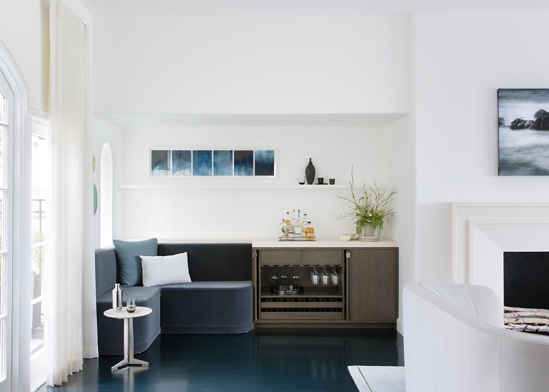
I have learned 2 great lessons from Mead. The first, is be true to yourself. If you look at the photos in this article, you will understand Mead. Her work reflects her personality. She is serene, , elegant, understated. As you get to know her and get to know her work, it just makes sense. She plays to her strengths and doesn’t try to be anyone else.
The second is the importance of negative space. Every wall does not need to be filled. Less is more. Less stuff = more calm. Editing is important. Sometimes it makes sense to take something away to allow things room to breathe. Your eyes need places to rest.
Mead started her own design firm 5 years ago, and I couldn’t be more proud of my dear friend! Check out the article to learn more.


